Engaging and Innovative Interactive Navigation
The progression of interactive design has changed dramatically over the years. From a time when websites consisted only of hyperlinks, text and if you were lucky images. Now, interactive media such as photos, audio and video define the experience. Especially, with programs like Flash that allow the designer to augment the overall experience with creative aesthetics and animation.
However, navigation has not followed the same progression. Websites like Google and Facebook pride themselves on providing information in a clear, simple manner. Simplicity often leads to minimalism or in regard to navigation, that which runs along the top or left-hand side of the browser window.
As more consumers turn to the web, marketers and advertisers must translate the brand experience in their brick and mortal to their digital storefront. When architects design a retail experience, they are required to think about every element and principle of design. This same perspective should be applied to interactive design and navigation: that which creates an engaging experience and guides the user through the experience in a creative manner to foster an enduring relationship.
The Hartman Group’s Gnomenclature on Sustainability
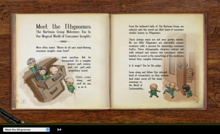
The Hartman Group took the idea of a classic children’s fairy tale to report their findings on sustainability from A to Z. Literally, with each “chapter” defining the key findings (i.e. C is for Carbon Footprint). The main characters are Ethngomes or the Hartman Group researchers. The engaging element and creativity of the navigation is that it’s designed to look like a book and the navigation guides the user to click on the page in order to progress. The user is curious to find out what comes next, much like reading a great novel.
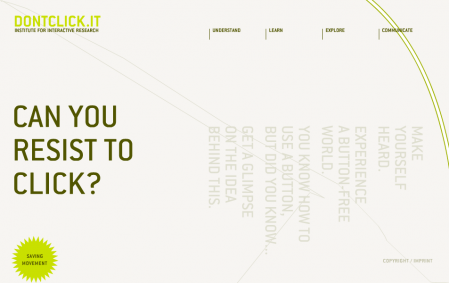
The Institute for Interactive Research wanted to push the boundaries of what we understood and expected in regard to interactive navigation. The premise of DONTCLICK.IT is that it’s a research study to test whether users’s are willing to navigate websites in a different way, not by clicking, but rolling over different site sections to explore. There is a very uneasy feeling when you can’t click on the sections you want to visit, however the dynamic environment that unfolds before your eyes is intriguing and the natural movement through the site is expedited. This site was built in October 2005, however I found this on StumbleUpon about a month ago. Even though the site is three years old, the point they are trying to make is still relevant, especially as media becomes more fragmented and consumers have less time, they will want information that is dynamic and fast (similar to what we are seeing with social networking).
This site truly defines innovation for interactive navigation. It takes the minimalist perspective, but creates an experience that embraces the internet, specifically social media and does not follow the norm. Besides the fact that this site is brilliant and I work there, I really enjoy the warning message once you visit the site:
Do not be alarmed.
You are viewing Modernista! through the eyes of the Web.
The menu on the left is our homepage. Everything behind it is beyond our control.
This is very truthful of the web. By opening the company up to everyone, they are taking a risk. But at the same time, this is what makes it so exciting and innovative.


